


Case Study: Johnnie Walker
- celiabistit
- Oct 12, 2022
- 10 min read
A. Abstract
Johnnie Walker is amongst one of the most popular brands on a global scale and has been “going strong” for centuries. This case study will proceed on closely inspecting one of their poster ads from the 1950s. The iconic and timely logo of the brand, The Striding Man, has become a symbol of progression and purpose. Furthermore, the ad highly engages with your average, full-of-class male back then, and speaks to him through the use of signs which come in words, colors, and symbols. These work in a complementary combination and make for a successful message to be conveyed.
B. Introduction
Alcohol has withstood the test of time amongst the centuries and has become one of the biggest productions worldwide. Johnnie Walker is one of the most well-known alcohol brands globally. This brand of Scotch whisky has been around for a relatively long time. The funding of the company goes back as far as the 19th century, and more specifically 1820, by a grocer named John Walker. The distribution of whisky was inconsistent at the time, and the taste often left people skeptical. Therefore, said John Walker, began mixing whiskies in his mother’s grocery store in Scotland, in order to reach a desired product (Paavola, 2006, p.2).
Over the years, their variety of blends has inevitably become wider. The Johnnie Walker ad I have chosen to analyze is specifically promoting their two most famous blends, Red Label and Black Label. The poster ad is from 1950; but considering the brand has been around since the beginning of the 19th century, it is not as old. In fact, by the time this ad had come out, Red Label had already become one of the best-selling whiskies. It is also vital to note that, given the time, consumption had significantly been heightened since World War II had been brought into a halt. This provided common ground for the domain of advertising, amongst other mediums of entertainment, to prosper.
I believe that Johnnie Walker advertisements as a whole are very convenient for analysis. The Striding Man, that is perhaps just as of an iconic logo as the product itself, has changed and adapted throughout the years. In addition, the particular poster combines elements of representative colors, and language, as well as, of course, a version of The Striding Man.
C. Method
In general, semiotics refers to the meaning we get out of signs, and how those are subsequently interpreted it. According to Daniel Chandler’s book, the shortest meaning we can possibly give to semiotics is “the study of signs,” (Chandler, 1994). Words, body-language, symbols, sounds, colors and much more, are all considered signs that are up for interpretation. Within the same book Chandler mentions the meaning Umberto Eco gave to the study of semiotics, “semiotics is concerned with everything that can be taken as a sign,” (Chandler, 1994).
Semiotics is split in three subgroups, which was syntax, semantics, and pragmatics. These refer to parts of the sings, such as, for example, the grammatical structure, the associative meaning, and the function within the context.
This process of acquiring and extracting meaning from visual or linguistic signs is a similar process to encoding and decoding, a theory by Stuart Hall. The receiver decodes the message and processes it accordingly. It is also vital to understand the concept in which a sign is embedded but also the medium of communication, in order to make the correct meaning out of it.
Judith Williamson contributed in this vastly with her book on decoding advertisements. She focused more and discussed on the way advertisements work, and how the audience decides to intake the information. “We can only understand what advertisements mean by finding out how they mean, and analyzing the way in which they work,” (Williamson, 1984, p.17). Therefore, she proceeded on constructing four stages through which we are supposedly influenced by an advertisement. Advertisements can certainly embed themselves in our cognitive processes, yet they are not powerful enough, unless we give meaning to them, similar to the majority of instances in our lives. The first stage is the creation of meaning, then follows how we are created through the ad. The third stage is how we create ourselves within the ad, and finally the fourth stage is how we take the meaning and integrate it in the basis of our everyday life.
To aid these processes Williamson talked about, it is essential to also be aware of more literal concepts such as rhetorical tropes and appeals that drive us towards extracting meaning. “Tropes generate ‘imagery’ with connotations over and above any ‘literal’ meaning,” (Chandler, 1994). Therefore, rhetorical tropes are figures of speech that do not literally convey exactly what it is that they mean.
Speaking of this poster ad in specific, there are a lot of visuals up for interpretation. For example, the representative colors of the brand have different connotations but as well as denotations. The Striding Man, who is the timely mascot of the product is certainly given a meaning, from the way he is dressed to the concept he represents. The verbal text is furthermore enriching the concept of the whisky and aiding in the meaning the audience gives to it.
D. Description
At first glance, this Johnnie Walker poster ad evokes a warm feeling within the audience. It is, perhaps, a combination of the colors, the text, and the pleasant looking Striding Man that make us feel a sense of authenticity and respect.
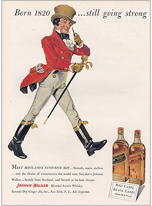
Primarily, the biggest emphasis is on the writing. The headline reads, “Born 1820… still going strong.” Immediately, the sense of authenticity reaches the audience because it is implying that after all these years, they have mastered their product, which was and is in fact prospering amongst the markets. Considering this ad came out in 1950, 130 years’ worth of production must mean something positive for the brand.
Furthermore, the paragraph of writing at the bottom of the poster ad, puts in words exactly what the product is and tastes like to accentuate the success. It begins by saying, “MEET SCOTLAND’S FAVORITE SON,” written in capital letters to give prominence. The son they are referring to is, of course, The Striding Man who represents the founder of the famous whisky, John Walker. The use of the word ‘son’ makes reference to Waller and the way he put a start to this brand, by initiating his mixology of whiskies in his mother’s grocery store. Once again, this is implicitly touching upon authenticity. He started from nothing and successfully created a brand which he eventually elevated to one of the best-selling whiskies in the world. To add to this, the description of the liquor itself is listed under words such as, “smooth, suave, mellow,” immediately sparking interest. Especially if this ad is interpreted by whisky lovers, it is a winner. Smooth connotes to the way the liquor goes down, without leaving a lingering unpleasant aftertaste, which was the problem John Walker faced with whisky in the first place, and therefore started making his own. Suave connotes to something more sophisticated, and while it is generally used to describe individuals, it gives the liquor a personality and gains it respect. Finally, mellow also refers to the pleasant taste. It also mentions, “Scotch at its best,” which talks up to the product even more, while having already described it in a manner that is winning for the audience.
The main visual of this poster ad, as well as its logo, is the eminent Striding Man, and representative of the brand itself, John Walker. This logo has been very influential in the commercial world since for more than a century now. It began with Enrique Anduze, who was the marketing director of Tom Browne “drew on the back of a napkin the famous Striding Man character based on an old photograph of John Walker,” (Caribbean Business, 2015, p.75). The representation is meant to show the striding towards progress. The logo underwent changes throughout the century, and took many forms, yet it remained The Striding Man. The denotation of this logo is that it is legitimately a well-dressed and seemingly respected man marching forwards and straight into improvement. The specific version of the logo illustrated in the poster ad under analysis was designed by Clive Uptonn. Unlike the rest of the previous, as well as later versions, this version of The Striding Man has a lot of details. The audience can clearly detect his facial features and his attire. He is dressed in red timely vest, with beige spandex pants, and horse-riding boots, whilst holding a cane/ In this poster ad, he is seen smiling in success. This conveys exactly the meaning of The Striding Man, who is, as the word very explicitly says, striding towards success.
The colors that dominate this poster ad are a few, such as beige, black and red. They are also representative of the blends for which this advertisement is. One bottle is called Red Label and the other is called Black Label. The font of the poster is beige, whilst everything else is in black or red. The Striding Man is also dressed in red, beige, and black making him appear fashionable and full of class. As far as the text goes, most is in black letters, apart from the brand name “JOHNNIE WALKER,” which is in capitals and in red. This makes it stand out, as this is the brand, that they are advertising for; therefore, they want people to be aware of that.
The main product is placed at the right bottom corner of the poster. It is a relatively small frame of the two bottles, the Red Label, and the Black Label. In front of them is a label with the names, which is used quite literal here considering the title of the specific liquor bottles. On the tag, it is also noted the bottle strength of the liquor which is 86.8 proof. This information elevates the whisky in the eyes of the audience, and additionally it provides specifications that show the quality of the product.
E. Questions
There is a two-part model used to explain the meaning we give and get from signs. This dyad was introduced by Ferdinand de Saussure. “The Signifier is the material object, and the Signified is the meaning,” (Williamson, 1984, p. 17). Now, speaking precisely about the Johnnie Walker ad, the signifier is first foremost The Striding Man. As mentioned prior as well, The Striding Man has been taking different forms and shapes over the years. However, the meaning it represents has remained the same. The connotation was and is that this animated representation of John Walker is striding forwards and towards success. A while before the ad under analysis was published, The Striding Man began representing more. “He was a veritable font of information, conveying tidbits of knowledge about the distilling process to would-be consumers…” (Staff, 2017).
For example, the headline of the ad reads “Born 1820… still going strong.” The meaning we can extract from this can be literal, like regarding the fact that the brand has been prospering and going strong for years amongst the markets. It can only be seen from a more metaphorical point of view, which can imply that The Striding Man keeps walking forwards nonchalantly, embossed on the liquor bottle of our hearts. This can also be seen as another rhetorical trope besides a metaphor, like a synecdoche which stands for a word carrying more than one meaning. The use of the words “still going” can be interpreted as literally “striding,” “succeeding,” or “progressing.”
The words used to describe the liquor, which are “smooth,” “suave,” and “mellow,” are also used in a metaphoric way. “Smooth” indicates the softness of the liquor, which does not leave a bitter or unpleasant aftertaste in its path. “Suave,” on the other hand, is usually used to describe an individual, and it is a synonym for sophisticated. This is exactly the vibe this advertisement wants to communicate to the consumer; that this is a sophisticated drink, for a sophisticated consumer.
There is also a lot of resonance elements prevalent in the poster. The colors work in a complementary combination of one another and serve for the appropriate mood to be communicated. The same way the background, the writing and The Striding Man work in unison, the text itself puts in words exactly what they are trying to achieve.
As far as appeals go, they are very important in order to reach an audience. Generally, appeals refer to the way a message is communicated, it can be done through humor, irony, sex, and a variety of more. In this case, and speaking about this Johnnie Walker ad, it has a high personal appeal. This is directly related to emotional appeals, as it targets a person’s emotions and relatability in order to persuade them into purchasing the desired product. This ad specifically advertises the Red Label and the Black Label blends of their scotch. The core brand values of the Red Label whisky specifically highlight passion, progression, and masculinity (Paavola, 2006, p. 19). This is precisely what this ad touches upon, and subsequently enables a leeway between the brand and the average consumer, who at the time must have been a male in awe of progression and high-class, just like The Striding Man. Blinding optimism seems to follow after every war, and in the case of the time at which this ad came out, World War II, leaving people eager for improvement. However, another war did not take long to arrive. Despite that, “the onset of the Cold War brought with it an increased sense of the importance of consumption as a civic duty,” (Taylor, 2012, p. 102).
It also seems to have a social appeal, as the progress they are referring to is collective. The Striding Man is “still going strong,” and as well as the consumption of the product, which the consumers have aided. It appeals to the social environment of their targeted audience and gives a sense of relatability as well.
F. Conclusion
To conclude, this was a very pleasant research to have conducted. It is surprising to discover the amount of analysis one single ad can reach. Even if it looks straightforward to the eye, the elements that make it up work in unison to deliver a successful end product, which will eventually reach the targeted audience successfully.
For future research, it is always important to keep in mind a backstory of the brand and subsequently the campaign under inspection, in order to grasp a better understanding of the message they are trying to deliver.
Works Cited
Chandler, Daniel (1994): Semiotics for Beginners. http://www.aber.ac.uk/media/Documents/S4B/semiotic.html
Johnnie Walker’s Striding Man design in step with the times. (2015). Caribbean Business, 43(33), 75.
Paavola, N. (2006). Building the Johnnie Walker Brand.
Staff, V. (2017, July 18). A Visual History of Johnnie Walker's Striding Man Logo. Retrieved June 03, 2020, from https://vinepair.com/wine-blog/a-visual-history-of-johnnie-walkers-striding-man-logo/
Taylor, T. D. (2012). The sounds of capitalism : Advertising, music, and the conquest of culture. Retrieved from https://ebookcentral-proquest-com.acg.idm.oclc.org
Williamson, J. (1984). Decoding advertisements: ideology and meaning in advertising (Ser. Ideas in progress). Boyars


Comentários